
Typography
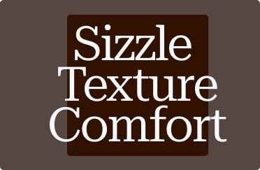
Our typographic system is led by Roboto Serif — clear, warm, and quietly expressive. Its balance of structure and character reflects DOL’s blend of tradition, texture, and modern Korean dining.
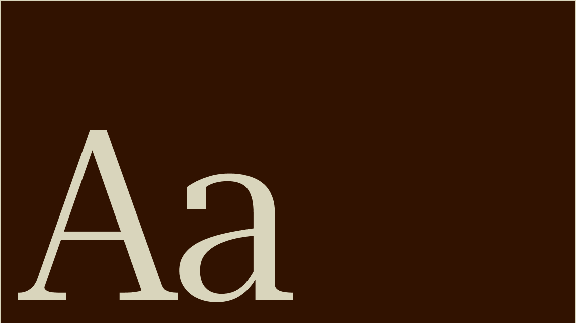
Primary typeface
Roboto Serif gives DOL a voice that feels warm, crafted, and timeless. Its blend of classic character and modern clarity reflects the brand’s connection to Korean tradition and contemporary dining.
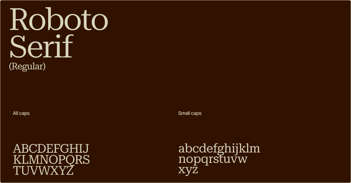
Secondary typeface
Inter Tight supports DOL with a clean and modern voice. Its compact structure ensures clarity across everyday communication while complementing the warmth of Roboto Serif.
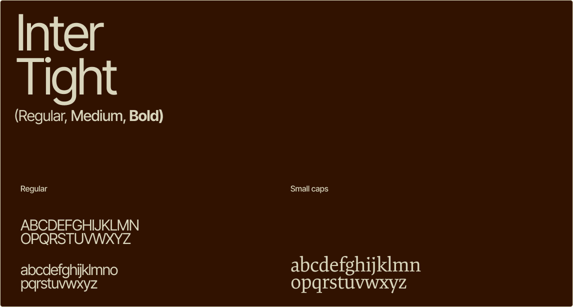
Text lockups
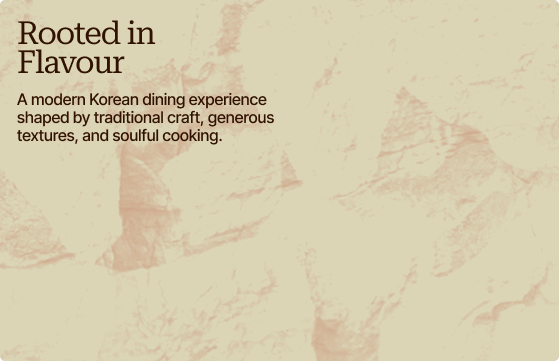
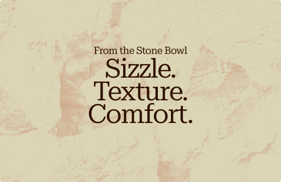
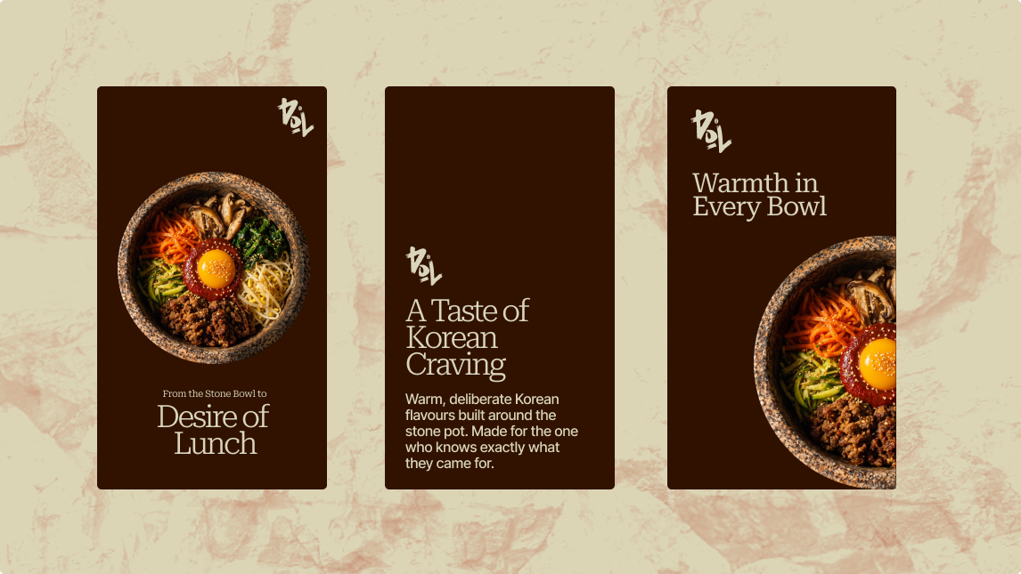
DOL’s text lockups combine the warmth of Roboto Serif with the clarity of Inter Tight. Together, they create a typographic system that feels expressive, balanced, and unmistakably DOL.
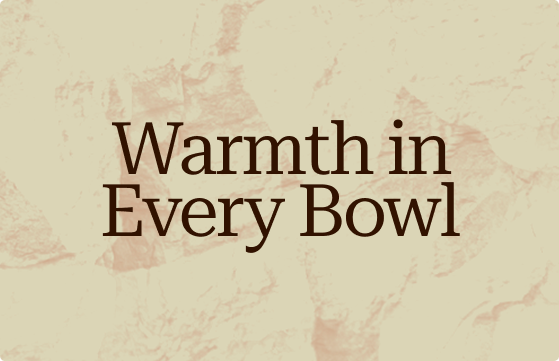

Applications
Things to avoid
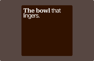
Don’t mix together both primary and secondary font in one line.
Don’t cut off the text.

Don’t justify or increase the letter spacing.